The creative soundtrack series is back after a little Stationery Show induced vacation! iTunes and YouTube have been my best friends this week while I work on fulfilling Stationery Show orders and work on a few custom projects. Here's a few songs keeping me company.
Mumford and Sons - The Boxer (Simon and Garfunkel cover)
Vampire Weekend - Unbelievers
The Lone Bellow - Green Eyes and a Heart of Gold
Recently, Amy Patrick of Thalia Engineering Studio in Houston commissioned Happy Cactus Designs to create custom stationery for her company. Not only did Amy and I go to school together for eleven years, but we're also both small business owners, so I was thrilled when Amy approached me! Amy's envisions Thalia as an engineering studio that puts clients first (I love her manifesto about her company's core values). Keeping in line with that vision, Amy tends to write a lot of personal notes to existing and potential clients and wanted a design as unique as her company.
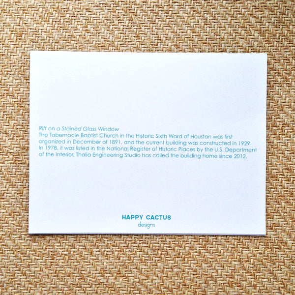
Amy sent over a folder of her marketing materials and gave me leeway to do whatever I wanted (both exciting and daunting). When I asked her for any inspiration or ideas she had in mind, Amy emailed me a photo of a stained glass window in the building where she offices. It seems that Amy hit the office space jackpot and works from the loft of a church that was constructed in 1929. It now houses office spaces and has been listed in the National Register of Historic Places since 1978!

I immediately knew I wanted to build a motif off of the beautiful stained glass window. I hand-drew an outline of the top of the window and then created a pattern out of the shape. I also showed Amy a design of hand-drawn dots in shades of teal (Thalia's signature color). Amy loved both and we worked together to combine the two designs into one. Voila! The final product!


On the back of the note card, a little note was included about the inspiration for the design.
This was such a fun project to collaborate with Amy on and I'm so pleased with how the cards turned out. Best of luck to Thalia on its endeavors!


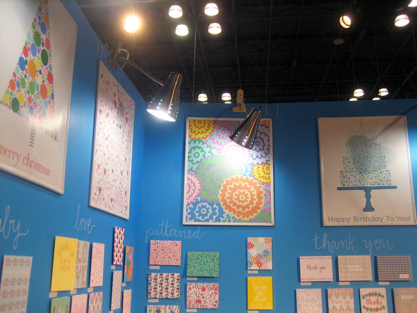
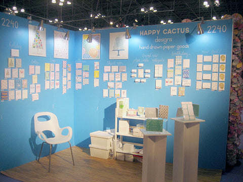
In a departure from last year's white walls with hand-drawn accents, this year I decided to do blue foam core walls for my booth. I was extremely happy with the color choice because it really made my colorful products pop. When we first arrived at the Javits, the floor itself was pretty empty, so we quickly got to work laying down the foam tiles and lining up the electricians to help with my lighting.
![]()
I then applied the vinyl decals (not as scary to do as I thought it would be).

Since many of my cards include small, intricate details, I decided to blow up some designs to poster size and hang them along the top of the wall.

I kept the furniture simple: a modern white chair and white bookcase that doubled as a display area and storage space. Since my booth was on a corner, I purchased two pedestals to display products and attract people walking by. The card categories were hand-written by me onto the walls using white paint pens.

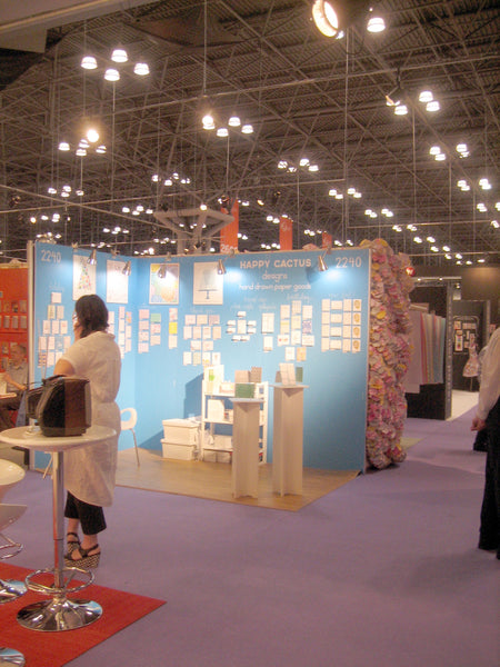
Booth details:
- Signage: I used custom vinyl decals to display my company logo and booth number. I hand-lettered the card categories onto the walls using white paint pens.
- Flooring: I reused my oh-so-comfy faux wood foam tiles. They are the best when you are standing most of the day. It's funny how many buyers comment on how comfortable they are when they walk into your booth!
- Lighting: I splurged this year and did a parcan spotlight. The Javits electricians were able to position the parcan perfectly to highlight my products. I added additional clamp lights to fill out the lighting. Having great lighting is essential to showcasing your products and I was very happy that I went with the parcan this year.
- Walls: Custom blue foam core walls from Manny Stone.
- Furniture: Two display pedestals, lightweight white plastic chair, and a white bookcase for product display and storing items like catalogs and samples.
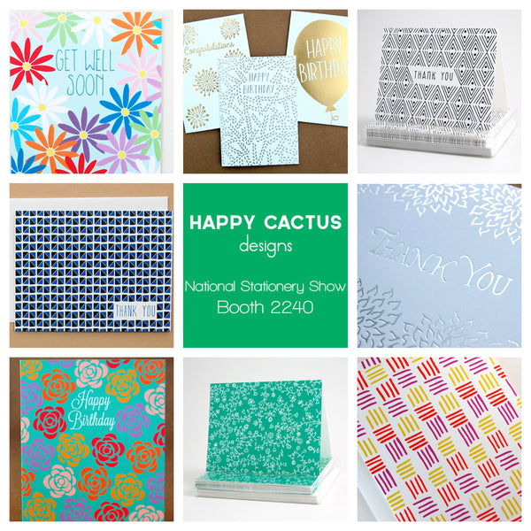
Happy Cactus is off to New York City for the National Stationery Show. We are beyond excited to be back for our second year and to debut a number of new products. If you are attending the show, please come visit us at Booth 2240!
I recently mentioned that I was thrilled to be included in UPPERCASE Magazine's special stationery issue. Now you can view the entire guide online for free! The guide profiles 50 independent stationery designers from around the world and I'm so honored to be included amongst so many talented artists. Check out the entire guide here, and order your issue from UPPERCASE so you can read the entire issue in print!

I'm leaving for the National Stationery Show in a few short days, and I can't wait to share my new products with retailers attending the show! Here's a behind-the-scenes look at my pre-show mailer that I recently sent out to stores. It's customary to send invitations to retailers inviting them to visit your booth at the National Stationery Show. This year, I did a 5"x7" flat card using a design based off my new Emerald Flowers patterned card (debuting at the show).

The front of the card had pertinent information about my booth and new product releases, while the back was covered in the hand-drawn floral vines. The white against the emerald green color really pops!
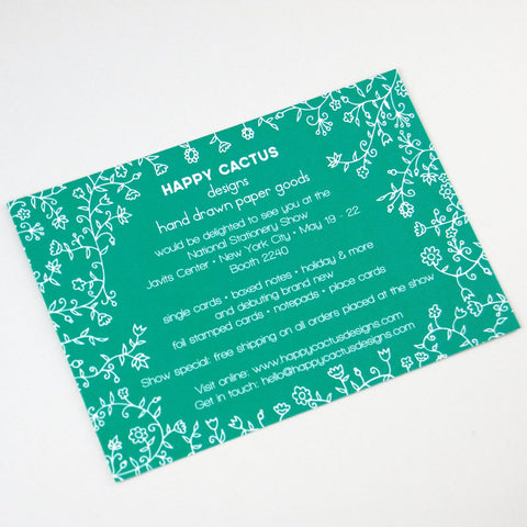

I decided to use a kraft envelope and wanted to use white ink for the address. One of my favorite parts of the mailer is the floral oval stamp on the front of the envelope that I wrote each retailer's address inside. I had a stamp made based on an original drawing that matched the card's floral vines, then I stamped each envelope using white ink. I used a white gel ink pen (my new obsession) to hand-address each card.

Finally, I choose the USPS's brand new vintage seed packet stamps. I absolutely adore these stamps and loved the bold flowers against the brown kraft!
I hope retailers enjoyed receiving these invitations as much as I enjoyed putting them together. See you at Booth 2240 in New York!
It's been a crazy busy week wrapping up many Stationery Show related tasks. Happy Cactus will be headed to NYC next week for the show, and starting Monday I'll be sharing some sneak peeks of new products. If you can't wait until then, check out this preview on the wonderful blog Paper Crave!
For this week's creative soundtrack, I'm sharing a video of Jim James (from My Morning Jacket) performing on Late Night with Jimmy Fallon. It's one of the best performances I can recall seeing on a late night talk show and has been my jam all week!
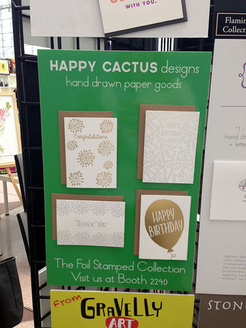
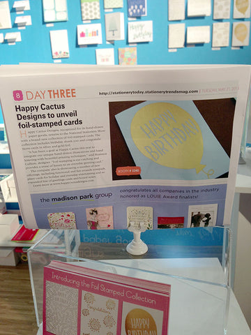
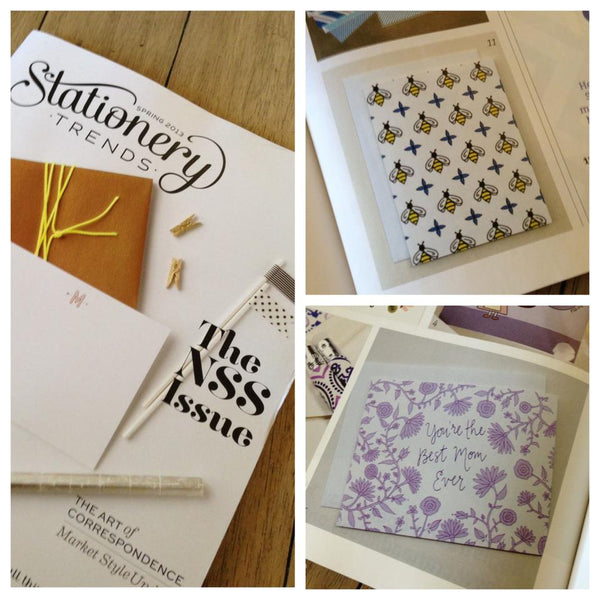
I have been eagerly awaiting the latest issue of Stationery Trends, the leading stationery industry trade magazine, and was so excited to see that two new Happy Cactus cards are featured in its pages! This is the special National Stationery Show edition and I am so honored to be included alongside many other talented designers. This is also the first issue featuring the newly revamped design and I love what the editors have done!
Today I thought I'd share some behind-the-scenes images of my new Mother's Day card since the holiday is just a week away! The idea for this card was conceived during a major creative session last fall. I knew I wanted to do a card with an all-over floral design, not just a repeat. It started as a light pencil sketch on drawing paper, then I went over the design in pen. Like the majority of my work, the design developed as I drew it - I didn't have a set plan for what the "blooms" would look like.

I left space in the center for a sentiment, and eventually decided that this feminine design would be perfect for a Mother's Day card. The size of the space worked perfectly to pen "You're the Best Mom Ever."

After scanning my design and doing some minor clean up, I decided upon a purple color palette, using a lighter lavender shade balanced by a darker purple for the outline. And after a lot of focused work, the final product!


Home stretch of National Stationery Show prep means a lot of time working in my studio sorting, cutting, stuffing, and organizing all of my products and booth items. This also means the need for a really great work soundtrack. Here's what I've been listening to this week.
Iron & Wine - Grace for Saints and Ramblers