As much as I love color, I can't resist classic black and white. Throughout the Happy Cactus Designs stationery collection, you can find black and white in geometric designs and brush floral patterns. Here's a few favorites. You can shop all black and white favorites in the shop here.

Hand-Lettered Thanks Flat Note Card Set

Thank You Black and White Tiles Card
I was cleaning up my office the other day and came across this original drawing for the Thanks Garden card. Here it is alongside the final product!

One of my favorite products that I developed and recently launched is the assorted set of cactus flat notes. While the designs are an obvious nod to my company's name, they were also greatly inspired by a few trips I have taken to Big Bend National Park, Terlingua, and other areas of West Texas.

Each card features a hand-drawn cactus design. Then, to further set these designs apart, each cactus is hand-finished with gold paint by yours truly. Each card is truly one of a kind. They are sold as an assorted set of 8 cards - 2 of each design. You can them in the shop here.

While flipping through fashion magazines this weekend, I came up a great spread in Elle about the growing black and white windowpane trend. I think these picks look quite nice next to Happy Cactus' "on-trend" black and white grid flat note card! Pick it up in the shop here.

One card that is always nice to have on hand is a general thinking of you card. I feel like it's hard to find non-cheesy cards in the sympathy or sending positive thoughts your way categories, so good thing I can design my own! My intention was to design a cheerful card that could hold many purposes - for someone going through a tough time, someone who has lost a family member, or someone who is ill.

This design started with a row of hand-drawn tulips. Compared to some of my other more detailed floral designs, I kept things very simple. I selected a color palette that was bold and uplifting - reds, blues, pinks, greens, and yellows. "Keeping you in my thoughts" was hand-lettered by me in a loose script.

You can find this card in the shop here.
Today I wanted to highlight two new designs that share a similar theme: lots and lots of hand-drawn flowers. Believe it or not, the inspiration for these designs was an ornament I created as a fifth grader. I remember creating a design of colorful overlapping flowers using paint pens on a circular metal ornament.
For the birthday card, I developed an unstructured border of irises, hydrangeas, roses, daisies, and other flowers from my imagination. "Happy Birthday" is hand-lettered in a deep blue-purple.

I really liked the finished look of the birthday card and decided to try for a second card with a similar look, this time for a thank you card. The flowers in this design have a more tropical feel and I used a pastel color palette. "Thanks" was hand-lettered with my trusty brush pen.

You can shop both designs here.

Every so often, a design idea gets stuck in my head. I sketch the design, lay it out as a card, and then sit on it. That's the case with the Congratulations Banners card. I think I first drew out this design idea over a year ago, and could never pull it together...until now!

It features colorful hand-drawn banners and flags with hand-lettered words. I think it makes a great graduation card, but would be perfect for anyone celebrating a special achievement. Shop it here.
When brainstorming card ideas for the early 2014 greeting card release, I was hoping to create cards for categories where I was missing cards. I knew I wanted to design a sympathy card. While the Thinking of You Lavender card is a popular seller, I realized I really need a sympathy card that could be used for a variety of occasions. The So Sorry card fills that gap.

Sending a card to a friend or family member when he or she has suffered a loss or experienced a hard time can be so meaningful to the recipient. I hand-lettered "So Sorry" in a dark navy script and surrounded the lettering with light blue hand-drawn flowers. I think it's always a good idea to have one of these cards on hand so you can send it off to someone in need at a moment's notice. You can find the card in the shop here.
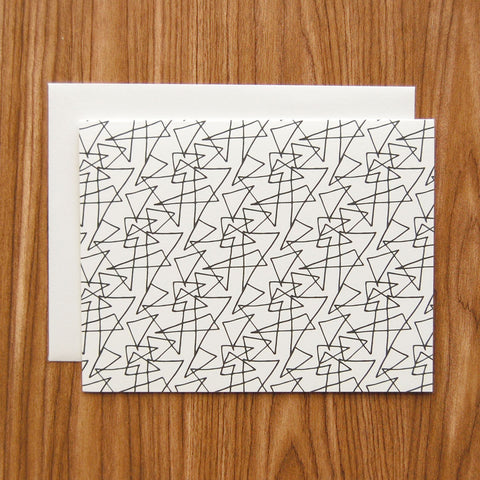
A number of the new cards I introduced at this year's National Stationery Show have a strong modern, simple, geometric influence, including the Patchwork Lines patterned note card. I created a pattern out of simple hand-drawn line motifs and used a color palette of bright red, marigold yellow, and purple. These three colors remind me of my grandmother - she always wore and appreciated bright, cheerful colors. The Patchwork Lines card is available as a single card or a boxed set of 10 cards here.


After launching my debut collection in 2011-2012, I had many requests to add more masculine thank you card options to my line. Guys need to write thank you notes, too, right?
When designing my Spring 2013 collection, this focus was one my mind. For the card below, I drew two small triangles and decided to use a navy blue and black combination. A pattern was created with the triangles and "Thank You" was inserted using a thin minimalist font.

I love the end result, and many buyers did, too! This card was one of my top three sellers at the Stationery Show this year! You can buy the Thank You Triangles card in the shop here!

One of my favorite new releases from the collection I debuted at the Stationery Show is the Tribal Lines Thank You note card.

I created an organic diamond pattern based off hand-drawn triangle and dot shapes I drew. While I love love love color, I decided to design this card using only black and white. It's both simple and complex, timeless and on-trend.

The Tribal Lines Thank You card is available as a single or as a boxed set of 10 cards. Shop it here.
Recently, Amy Patrick of Thalia Engineering Studio in Houston commissioned Happy Cactus Designs to create custom stationery for her company. Not only did Amy and I go to school together for eleven years, but we're also both small business owners, so I was thrilled when Amy approached me! Amy's envisions Thalia as an engineering studio that puts clients first (I love her manifesto about her company's core values). Keeping in line with that vision, Amy tends to write a lot of personal notes to existing and potential clients and wanted a design as unique as her company.
Amy sent over a folder of her marketing materials and gave me leeway to do whatever I wanted (both exciting and daunting). When I asked her for any inspiration or ideas she had in mind, Amy emailed me a photo of a stained glass window in the building where she offices. It seems that Amy hit the office space jackpot and works from the loft of a church that was constructed in 1929. It now houses office spaces and has been listed in the National Register of Historic Places since 1978!

I immediately knew I wanted to build a motif off of the beautiful stained glass window. I hand-drew an outline of the top of the window and then created a pattern out of the shape. I also showed Amy a design of hand-drawn dots in shades of teal (Thalia's signature color). Amy loved both and we worked together to combine the two designs into one. Voila! The final product!


On the back of the note card, a little note was included about the inspiration for the design.
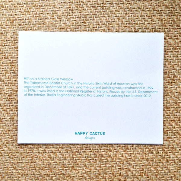
This was such a fun project to collaborate with Amy on and I'm so pleased with how the cards turned out. Best of luck to Thalia on its endeavors!